A detailed, station-level and route-level look at CTA ridership post-recession provides interesting observations on the city as a whole
 |
| (Image: transitchicago.com) |
The nationwide decline of transit ridership has been well documented. Steady years of hearty growth plateaud at 10.7 billion trips taken nationwide in 2014, which was up from 7.9 billion in 1996, according to the American Public Transportation Association (APTA).
While the declines vary greatly between metro areas, it is definitely a consistent trend across the United States. In 2017, Transit ridership fell in 31 of the US' 35 biggest metro areas and saw nearly a 3% decline in 2017. In 2018, the nationwide decline continued, this time closer to 2%.
It is not, however, a consistent worldwide trend. Yonah Freemark of The Transport Politic recently found that while US transit ridership saw an average decrease of 6% between 2010 and 2018, France transit ridership increased by a whopping average of 30%. After a small 2017 decline, even Canadian transit saw a 6% increase in 2018.
Back in the US, many cities have seen an urban renaissance in recent decades. This has continued with a vengeance post-recession, with Census Bureau estimates finding 47 of the 50 biggest US cities saw an increase in population between 2010 and 2018.
 |
| Aesthetics? Pass. It may not look like much, but the Washington station on the Blue Line saw 68% weekday ridership growth between 2010 and 2018, easily the highest in the system. (Image: Medill Reports Chicago) |
It is interesting, then, that transit ridership's decrease has continued even while its available market of residents, at least theoretically, has increased. This means transit ridership per capita has decreased even more significantly, and there are a handful of reasons why.
Chicago is a prime example of this population growth/ridership shrink paradox. The CTA's total ridership decreased from roughly 517 million in 2010 to 468 million in 2018, a decrease of over 9%. In the same time, the city's overall population has increased, albeit very slightly.
More significantly, however, is that many of the city's densest, most transit-rich areas near the city center, where there are more CTA lines serving more destinations available than anywhere else, have seen some of the sharpest population spikes. Between 2010 and 2017, huge population influxes have occurred in the Loop (+22%), Near West Side (+15%), Near North Side (+10%), and Near South Side (+10%). What gives?
 |
| The Morgan station on the Green and Pink Lines, a vital cog in the development of the burgeoning Fulton Market District, saw 30% weekday ridership growth even in the "ridehail era" between 2015 and 2018. (Image: David Wilson) |
Of course, with all the mobility alternatives available today, it is no longer a given that people moving into a transit-rich area will use transit at all. One of the most cited reasons for the nationwide transit decline is the advent of ridehailing services such as Uber and Lyft. While these services were initially promoted primarily as transit-complementary services, providing last-mile connections and a better alternative in "transit deserts", a trip data release from the companies earlier this year revealed that hasn't been the case.
Transportation planner and advocate Steven Vance found the most common Chicago ridehail trip to be between the western part of River North and the Loop. The Brown Line directly serves this trip as well. The second-most common trip was between the "Loop West" and O'Hare, which is directly served by the Blue Line, and the third-most common was literally within the greater Loop (classified informally as Loop West and Loop Northeast).
Clearly, lack of available transit options was not the impetus behind these trips, and higher budget elasticity among the higher average incomes in these areas can support far more Ubers.
Some of the other most commonly cited factors for the nationwide transit ridership decline have been increasing congestion in cities, which can make bus, streetcar, and light rail service especially slow and unreliable, lower gas prices, increased rates of car ownership, and the ever-dangerous transit "death spiral". The death spiral is that as transit ridership decreases, service is reduced, making the experience less convenient for riders who remain. This causes a further decrease, causing more service cuts, and so on.
 |
| Still the busiest bus line in Chicago by a comfortable margin, the #79 79th St bus has still hemorrhaged riders since 2010. Investment will need to be made in this route, and the communities it serves, to get it back on track. (Image: Lee Edwards/Block Club Chicago) |
Thankfully, here in Chicago the transit decreases have not been as severe in proportion to those in other cities, even if a 9% decrease is enough to have local officials worried.
But such a broad statistic doesn't tell us much about what's happening where in the city. And given the city's current drastically diverging plotlines--simultaneous explosive growth in population and income in some areas, such as the West Loop and River North, and continued depopulation and disinvestment in others, such as Englewood and West Englewood--it's worth a closer look. What conclusions can we draw from CTA growth and decline data across the city?
The CTA releases monthly ridership reports, and has published a cumulative year-end report since 2010. The 2018 year-end report was just released, and I've put it and the previous years' into a better way to synthesize over multiple years. The screenshots below include some insightful trends.
The year-end reports frequently mentioned here are from 2010 and 2018, the bookends of the comparative annual data, as well as 2015, which was a recent peak year for the CTA at about 1,641,000 average weekday riders. Rail ridership hit an all-time peak of 768,000 that year and has declined since. Bus ridership had actually already been declining slightly, but the decline almost completely leveled off in 2015 at about 873,000 per weekday.
2015 is also a notable barometer as it was one of the biggest growth years of Uber and Lyft into the mainstream Chicago marketplace, so the 2015-18 comparison is truly a look at ridership growth or decline within the "ridehail era".
 |
| Busiest CTA rail stations in 2010 and 2018 weekday ridership. Each station's text color in these tables represents which line it serves. If it serves more than one line, the text is black. |
First, a look at the busiest CTA rail stations at beginning and end of this time period. Clark/Lake, which had been the busiest station for some time, was dethroned by Lake (Red) in 2014, which has been the busiest station each year since.
In case you're curious, Kostner on the Pink Line has been the least-busy station since at least 2010, at less than 500 riders per weekday most years.
Note the spike from #15 to #4 for Washington (Blue), a significant drop for 95th, and a near flip-flop for Washington/Wabash and State/Lake--more on this later. Also, while the Washington/Wabash station didn't open until 2017, for sake of data comparison, its pre-2017 data consists of a combination between Randolph/Wabash and Madison/Wabash, the two stations it replaced.
(A somewhat misleading data caveat--note that the subway station Lake (Red) is technically counted separately from the elevated State/Lake even though they're mere steps from each other, while the Clark/Lake total combines entrances for both its subway Blue Line platform and elevated Loop platform. If State/Lake and Lake (Red) were also combined, its 2018 weekday ridership of 33,677 would blow all other stations out of the water.)
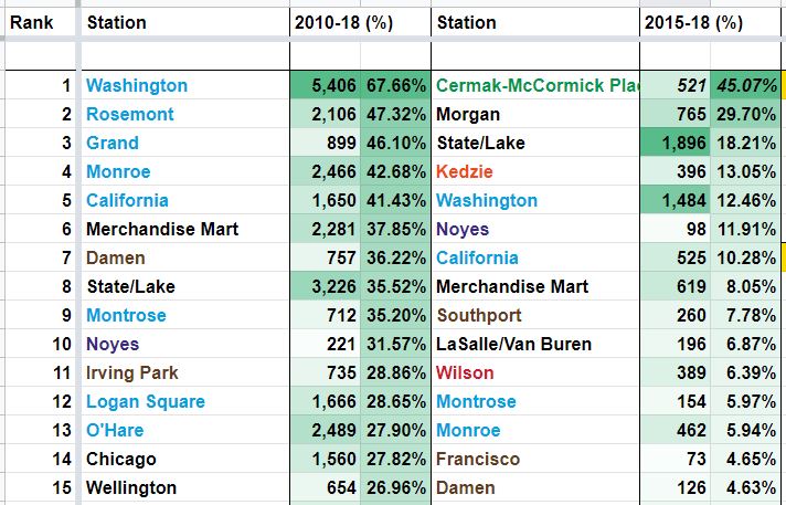 |
| Fastest-growing CTA rail stations between 2010 and 2018, and between 2015 and 2018, in weekday ridership. Between 2010 and 2018, 95 of 140 comparable rail stations saw growth, compared to just 31 of 142 between 2015 and 2018. |
Now, the fastest-growing rail stations, first between 2010 and 2018. Note that eight of these 15 stations are on the Blue Line, including all of the top five. All of them, however, are in its downtown subway or on the O'Hare Branch to the northwest. This won't come as a surprise to Blue Line riders--overcrowding on this line, which runs through some of the densest and fastest-gentrifying neighborhoods in the city, has been in the news regularly. Otherwise, six of these stations are served by the Brown Line.
Between 2015 and 2018, which we're calling the ridehail era, growth was led by a pair of brand new development-oriented infill stations on the Green Line, Cermak-McCormick Place and Morgan (however, note that Cermak's true increase would not have been 45%--the station was not open the entire year of 2015, so its weekday ridership average that year was artificially low).
Washington (Blue) and Monroe (Blue) continued their fervent growth, which is clearly a by-product of being main downtown destinations for those new riders on the Blue Line's O'Hare Branch. Don't look now, but little-known Noyes on the Purple Line, one of two stations that serves Northwestern University came in at #6 for 2015-18 growth, although at only 98 riders added, it clearly operates on a different scale than most others on this list.
 |
| Fastest-declining CTA rail stations between 2010 and 2018, and between 2015 and 2018, weekday ridership. |
Next we have the biggest decreases in the CTA rail system. Between 2010 and 2018, we find an alarming drop along the Green Line, both on the West and South Sides, and on the South Side Red Line. The steep drops at the Green Line's Halsted (& 63rd) and Ashland/63rd are consistent with the continued struggles of Englewood and West Englewood, which have lost over 11,000 residents since 2010 alone.
Despite a brutal drop 25% drop of over 3,000 riders, it will be interesting to monitor 95th on the Red Line going forward, as the CTA just finished the biggest station improvement project in city history there. The modern digs should make for a much improved customer experience, and the CTA is now even looking to fill eight adjacent parcels to the station with transit-oriented development. The surrounding Roseland community surely could benefit from such investment.
Between 2015 and 2018, the top decline came at the Blue Line's IMD station, although a station reconstruction project threw off its 2018 ridership number should have been. Otherwise, we find even more alarming declines on the Green Line, South and West Sides.
 |
| Busiest CTA bus lines in 2010 and 2018 by weekday ridership. |
Moving over to the bus side of the CTA, we find a fairly consistent group of lines topping the charts between 2010 and 2018. There is a consistent, palpable decline, however, across almost all lines. A couple of these have an excuse--the #9 Ashland and #49 Western dropped significantly because new complementary express lines were introduced on those streets in 2016, siphoning off a number of their riders.
The #79 79th, however, has no such excuse--a straight drop from 32,000 to less than 24,000 in 2018. And yet, shockingly, that 27% drop of over 8,500 riders did not even make the top 15 in bus route declines, as we'll see in the next graphic.
 |
| Fastest-declining CTA bus routes between 2010 and 2018, and between 2015 and 2018, in weekday ridership. Between 2010 and 2018, 105 of 120 bus routes declined in weekday ridership, and 108 of 123 between 2015 and 2018. |
Here's where things get tricky. Three of the top four on the 2010-18 decline list are contracted CTA routes funded by third parties, so they are limited services benefitting those entitites (in this case, #X98 for Avon, #169 for UPS, and #10 for the Museum of Science & Industry). The #11 Lincoln had a majority of its route cut in 2012, so no surprise there. And the next two are special event services for Soldier Field (#128) and the United Center (#19), which also vary greatly for reasons out of the CTA or city's control.
We'll also want to disregard the #9 and #49, due to the aforementioned express lines. Of the seven remaining routes, all but one exclusively serve the South Side.
Between 2015 and 2018, we find a similar story. Excluding the same lines as before, nine of the ten remaining lines serve the South Side.
There isn't much to write home about on the bus side of things in each time period. Between 2010 and 2018, and between 2015 and 2018, only 15 comparable bus routes saw weekday ridership increases. Perhaps most notable are a pair of South Side express services: the #26 South Shore Express (a 52% increase between 2010 and 2018) and #2 Hyde Park Express (a 33% increase).
Could it be because these are much more competitive services than your average milk-run local bus? Quite possibly. But a similar service in the #6 Jackson Park Express has seen sharp declines, so your guess is as good as mine.
Feel free to find your own line and station to hypothesize about it in the context of the city: here's the spreadsheet all of this comes from, which is data directly from the CTA's reports.
Access to opportunity is paramount for the economic vitality of the city across all demographic groups. Transit, in the form of CTA buses and trains, happens the be the most efficient way to achieve that for a city the size of Chicago. The good news is, especially if Canada and France are any indication, this doesn't have to be a permanent trend. Solutions are aplenty, but they'll take political will and capital. Mayor Lori Lightfoot has her work cut out for her.
No comments:
Post a Comment